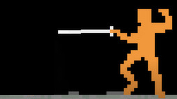
Integrated UI
Here's a recent addition to My Game Design Principles:
Video games often need a user interface (UI) displayed, like a health bar or a score shown on the screen somewhere. When possible, consider integrating any UI directly into the game.
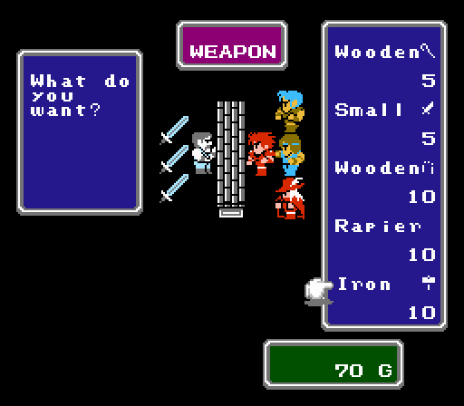
Shops and inventory management is often done through the UI with lists, modules, and scrollbars. They're not much fun to develop (at least to me). More importantly, they're not much fun to play.
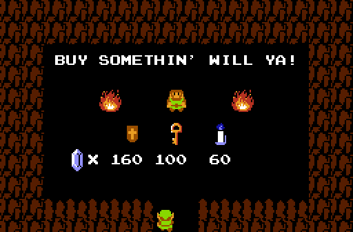
Rather than implementing shop UI, The Legend of Zelda integrated shops directly into the main simulation. To buy an item, you need only to move your avatar to the item and interact with it. It's more fun to shop and was surely easier to develop.
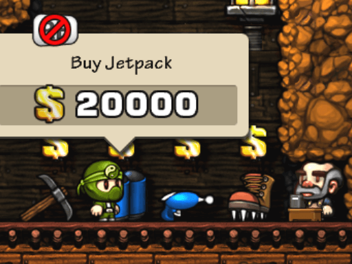
Doing as much as possible in-game puts less strain on development (see: Make One Game at a Time). It also encourages emergent gameplay. In Spelunky, mobs can walk into shops and steal items. This interesting interaction would be impossible if shops took place in a popup window.
Going further, bringing as much UI as possible into the core game sim can inspire cool ideas. What if instead of a progress bar, the player's health was represented by in-game entities that the player had to protect?
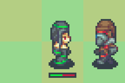
For example, a witch could have 2 health represented via hearts or a progress bar ...
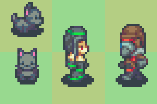
... or she could have 2 cats she has to protect. Sounds much cooler, and might lead to some unique gameplay!
Anytime you add some new UI, try brainstorming ways you could integrate it into your game instead.
