Happy Surfaces
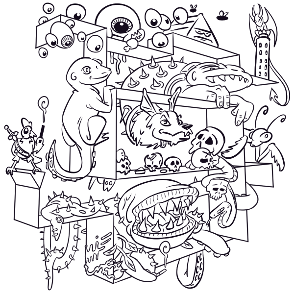
Sometimes when I'm drawing I have a difficult time filling the space. A blank page (or canvas) can be intimidating and without something to guide me I often get lost or stumble along the way.
Recently I tried an approach where I began with an arbitrary 3d structure before sketching out the scene. This structure helped me figure out perspective, ensured a decent composition, and gave me a kind of visual progress bar as I went.
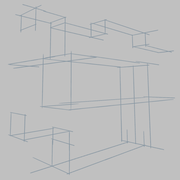
First I drew out a 3d structure. My goal was to establish perspective and fill the space in a satisfying way. My thinking was that if the underlying structure looked solid, then building on top of that should be pretty solid too.
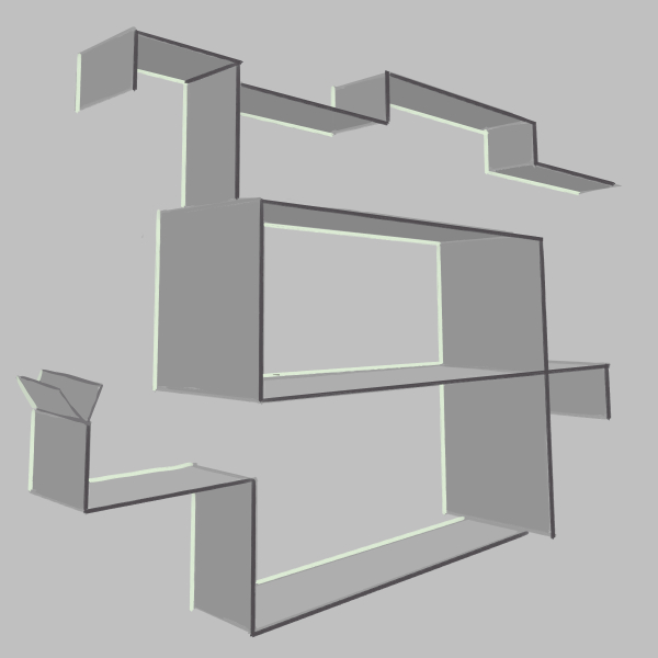
Once I had the lines laid down, I filled the volume with a midtone and shaded certain planes to ensure I still liked it when it was rendered out a little more.
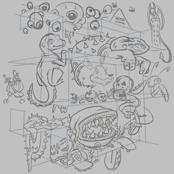
The flat surfaces looked so inviting I couldn't wait to start sketching. As I covered the surfaces with little creatures, I could easily see how many surfaces were left and it gave me energy to continue drawing.
Normally I find the remaining space intimidating, but the empty surfaces provided a starting point that made ideas flow more easily.
Pieces like this have given me a hard time in the past. For example, the promotional art for A Wizard's Lizard looks worse and took more out of me to finish. Using this "surfaces" approach, I even had enough energy left to add little easter eggs, including:
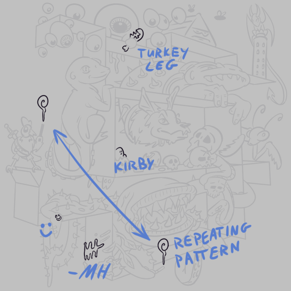
A turkey leg, one of my favorite foods to eat. A Kirby, the easiest Nintendo character to draw. A smiling face, because hidden faces are delightful to find. A repeating pattern, because I read they can make a composition more satisfying to look at. Lastly, I signed the damn thing because I don't normally and should more often.
Conclusion
This approach worked great for me and I'll be using it again. Next time I want to make the structure itself more interesting. The surfaces would make ideal tree branches, so maybe I'll give that a shot. Stay tuned!
